Thursday, 28 November 2013

Megaman 8 bit Response


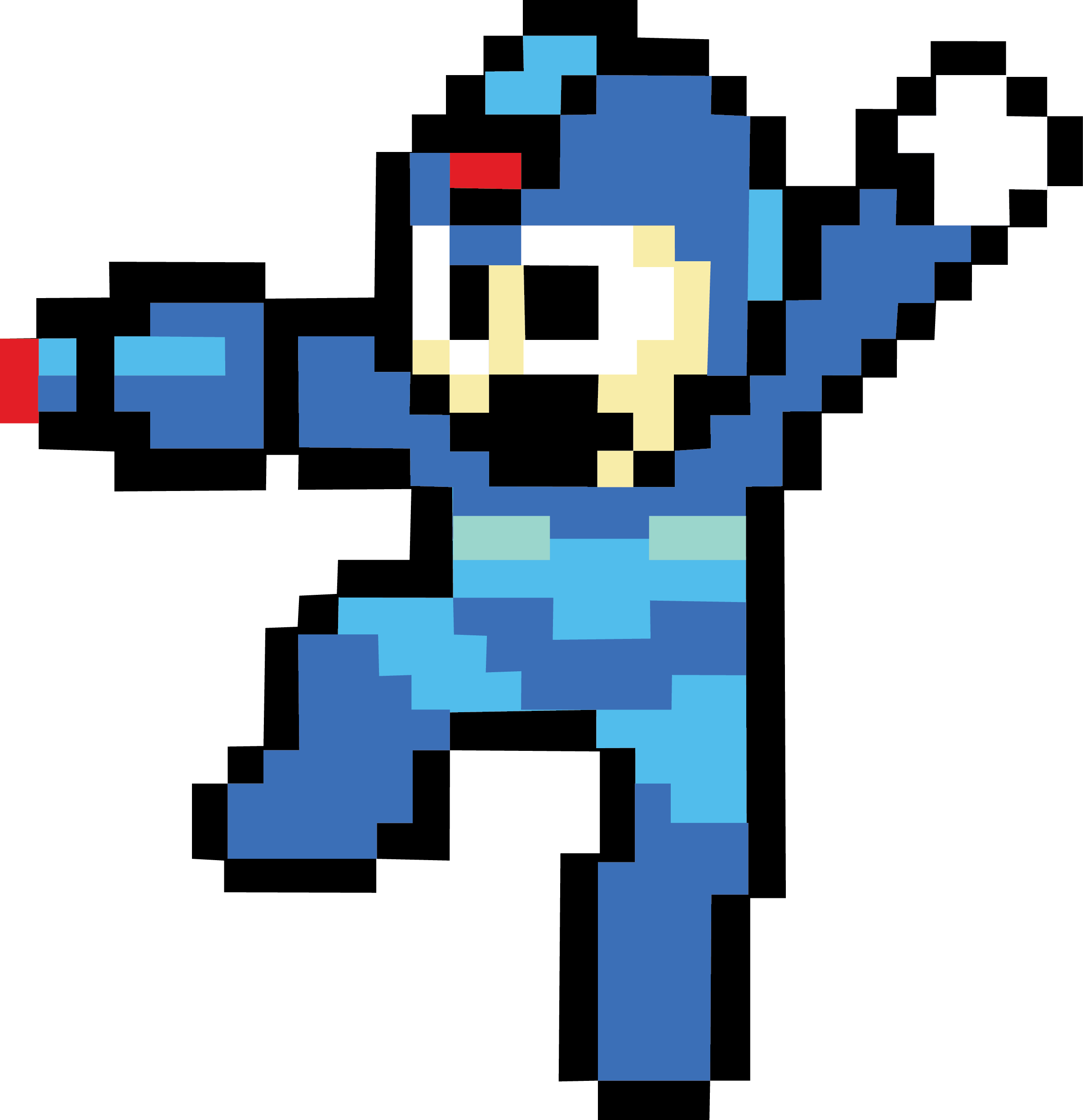
I have created a response of a 8-bit Megaman using mosaic tiles to give a more lifelike experience to the picture, but still with a 8-bit style texture to the image.

When creating the image I had an insufficient amount of tiles. To resolve this I created small parts of the image (each leg and arm) with the tiles and then put them together by taking out the cutting mat and putting them all together with Photoshop.

What I could have done to have improved this is if I took the images at the same height and outside of direct sunlight, since the sunlight is reflected off the tiles.


Thursday, 14 November 2013

Blizzard Entertainment Concept Art Analysis - ORC


This is a piece of concept art that was created by an artist working for Blizzard Entertainment. The stance that the orc is positioned is a standard pose for a character since it shows the entire model without anything being hidden. With his arms being both by his side, flexing his muscles  giving him the mood of having no fear of anyone and With him having no weapon, the stance he is giving can also give the feeling of him being prepared for a fist fight with an opponent.

The process of how this image was made seems like it was created digitally with a graphics tablet. With digitally created work the drawing looks shinier than materials such as paint or watercolour.

In this image the orc is wearing heavy plate armour on his feet and shoulder to signify his masculinity. The artist has given a minimal amount of armour because the orc uses brute force to demonstrate his strength so the armour will only slow down his heavy attacks and cause his mobility to be reduced. On the other hand the minimal amount of armour of the orc can give the viewer a view that the orc has been in a recent battle. The reason for this is that on one of his boots there is plate armour missing and the burn wounds give a further impression of him being in a battle that has caused him to have deemed his weapon or armour useless. Rough lines on the clothing can show meaning such as the gauntlets and his ripped cloth on his waist indicates that he has been in a hard battle and has taken a high amount of injury. From the rough and dark sketching indicates Wear and tear. Further burgundy red / maroon colours of his armour, since in the game the red armour represents the faction the orc is in. To the right is a flag of the orcs faction that is strongly dominated by the colour red. The colour red of the flag and the armour can strike fear into the enemies of the orc.  The use of the blending of the colours in the image gives the orc a realistic look of the armour and skin tone. when previously talking about the colour of his armour it gives a very angry look  to the image that is seen a lot in other games or films since orcs are not the most developed creatures and only focus on brute force and not defense.

The way the artist has created this word has influenced me greatly with my ideas of creating concept art digitally with a graphics tablet, This style could be created non digitally with paint to give it a more rougher look to it, whereas Digitally created illustration has given it a more shinier look which in my opinion does not represent a orc since in the image the illustrator has obviously tried to give the orc a rough and damaged look which paint would work better with it.

Tuesday, 12 November 2013

Okami Response

I have created a response on a piece of concept art for the video game Ōkami. I wanted to try to experiment with the same design but with a different animal. In the original design the artist has created this work digitally so the colours stand out more. the pattern used in the original design such as the circular patterns give the wolf a quite and gentle touch to the character.                                                                                                             with my response i wanted to try using felt tip pens since its a style i have not used yet. with using the felt tip it gave the picture quite a dull look and bland. If i was to recreate this, maybe with a different animal I will use watercolour.


Thursday, 7 November 2013

Analysis of artist Phroilan Gardner - Lich King

Phroilan Gardner Concept Art and Illustration


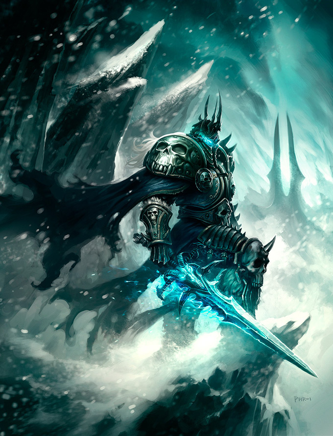
 Phroilan Gardener is an illustrator based in America were most of us work is based on characters from Video games and other lines of work to do with concept art. All his work is done digitally were maybe a piece or two of his has been done non-digitally such as with paints. He used a graphics tablet on Photoshop to create the Lich King

This piece of work that he created was from an already known character named Lich King from the PC game World of Warcraft. The reason he created the picture like this was for a poster or concept art which I am really heavily interested on.

On his blog http://phroilangardner.blogspot.co.uk/ it seems like he barely uses just line or one colour in his work for his poster / concept art. He is heavily based on using texture, form, blending of colours in each of his designs.
The way Phroilan Gardener uses  the turquoise colours on his eyes and sword can instantaneously understand that this characters soul has been  consumed by something and the dull grey colours also represent that there is barely any life in him that use to exist. His use of the formal elements such as Visual texture were he has scratches on his sword or the holes in his cape can make the viewer of this piece know that this person has been in many battles.  The way he makes the viewer feel like the image is cold is because he used dull colours such as black and grey. Turquoise  depicts the coldness to the drawing. There is a small amount of line, but when he does use it enhances the life-like appearance to the image. Such as the fur on the Lich Kings leg gives the fur layers and depth to the image. Also the greaves that he is wearing on his leg has been created with lines to give each layer of the greaves layers as if they were overlapping.

The way Phroilan Gardener used a large brush to paint the simplistic background gave more focus on the focal point which is the Lich King since he is far more detailed than the few brush strokes behind him.

Phroilan Gardener did use some sort of shape such as the small white circles all around the image showing that it is snow falling at a high speed giving it surreal movement. Some of the snow droplets have a lower opacity to some to the others to give it even more form to the image meaning some snow droplets are further away and some are really close up. 

The composition in the design shows the Lich King to be the focal point of the image. Such as the way his leg is raised and the sword is at the front shows his dominance to people / undead followers. This can be further shown by the way his head is tilted down to him looking down. whereas before I was talking about the turquoise look on his sword and helmet show he is in a cold environment and he has been consumed by something, the hilt of his sword most of his armour has skulls of animals depicts that he is of an evil kind and even promotes my last statement where he has been consumed by something evil.

The mood of the image portrays violence and a negative feel of sadness and death.

Wednesday, 6 November 2013

UEL Workshop - Etching

On the 24th October 2013 six students from the University of East London held a workshop for my A2 Graphics class were we took part in an activity and the classed learned a new technique called Etching that we could all use in our own work even after the workshop if we enjoyed doing it or if it was effective and correlated with their work.

How I made my own work with the etching tool

1)      I started out by taking my own drawing I made and expanded it in size with a photocopier. I then traced the design on a tracing paper with a pencil. After this I then put the traced drawing of my picture on a a4 sized silver sheet of reflected card.
2)      Now that the silver card has a rough outline of the drawing I used the ‘etching engraving tool’ to scratch away the parts of the outline. If I wanted to take out a whole space of the outline and create a much bigger line instead of a small line I would cut out a rectangular shape and then peel the silver card.
3)      After cutting all of the design out I covered the entire silver card with ink and used a cloth to remove any excess ink that I do not want to be shown on the final outcome. To get into the hard to reach spaces one of the University students recommended that I used a small cotton bud to erase the ink from the silver card.
4)      The penultimate step I used the copper plate press to press the card onto a piece of paper. Using high pressure on the card let all the ink transfer from the silver card to the piece of plain paper.
5)      Finally I peeled the of the paper from the silver card to reveal my final outcome of my etched drawing.


In my opinion this step is extremely useful for some parts of work but I cannot see myself using this for my theme of video games since for my final piece I do not want to use only the colour black.

Below are some pictures of the final outcome.